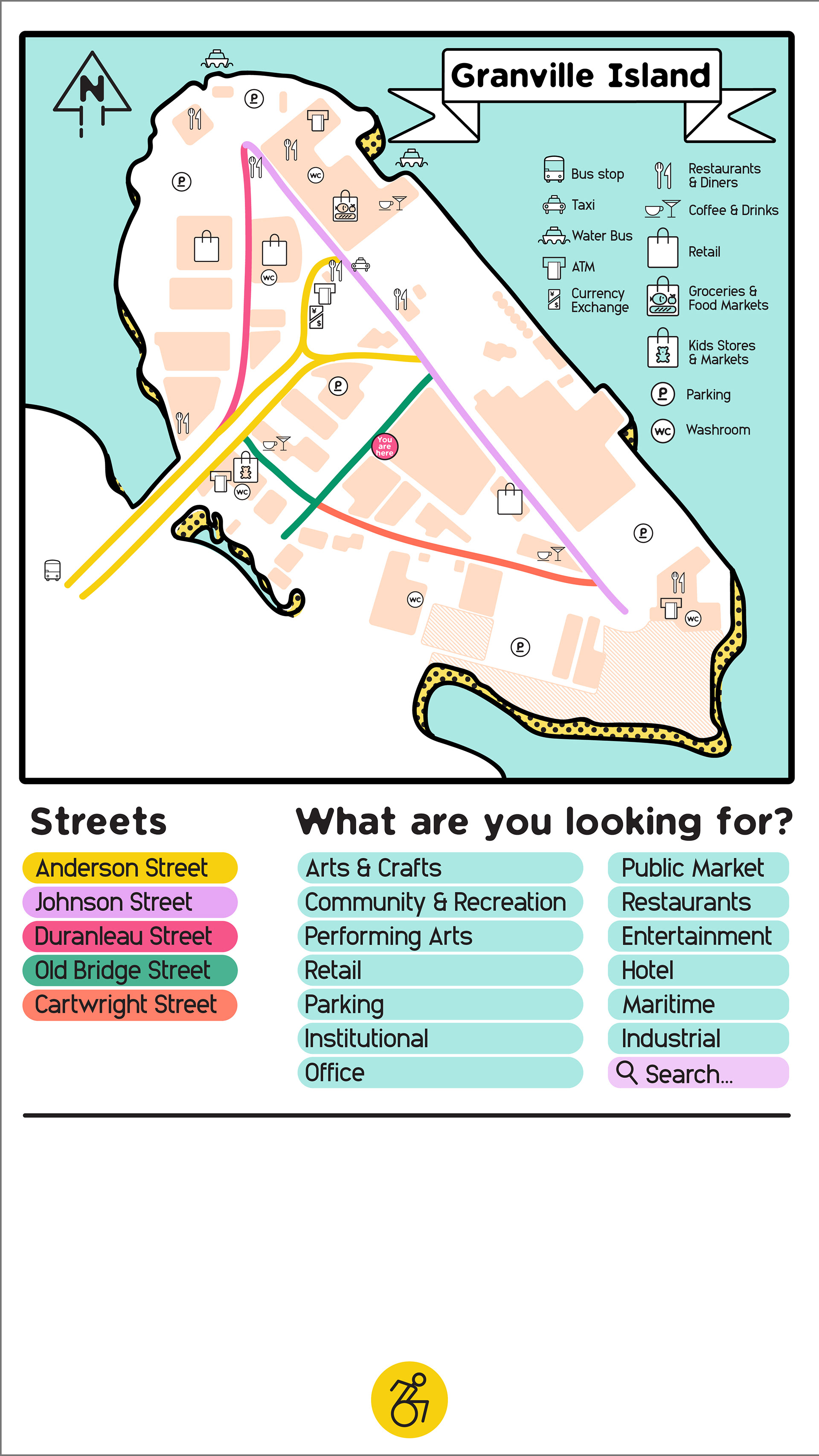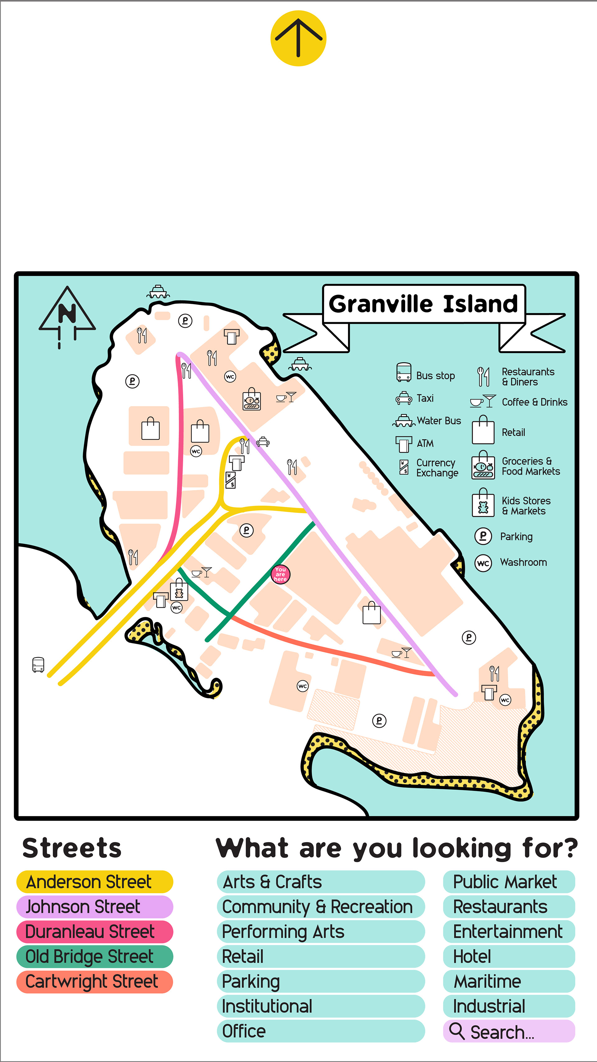
Anyone who has ever visited Granville Island in Vancouver might have noticed how confusing the street layout is and the lack of helpful information. This colour-coordinated signage system is meant to help navigate visitors around Granville Island.
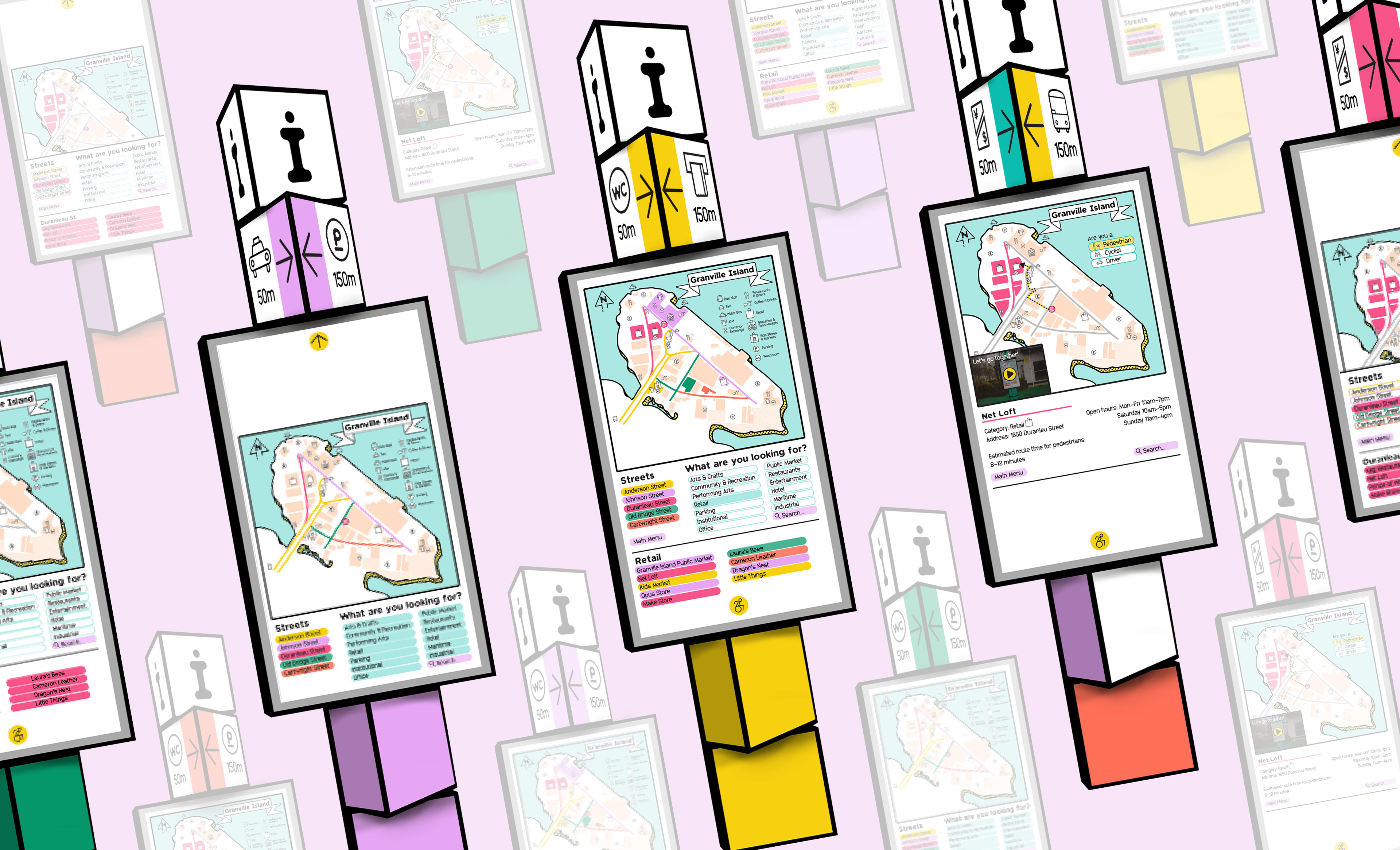
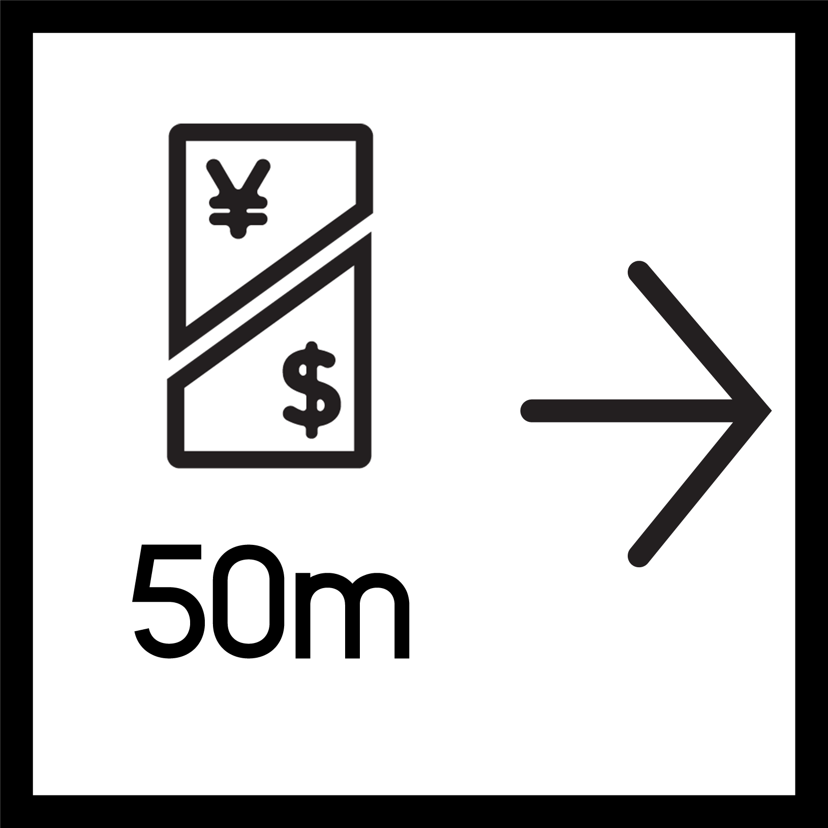
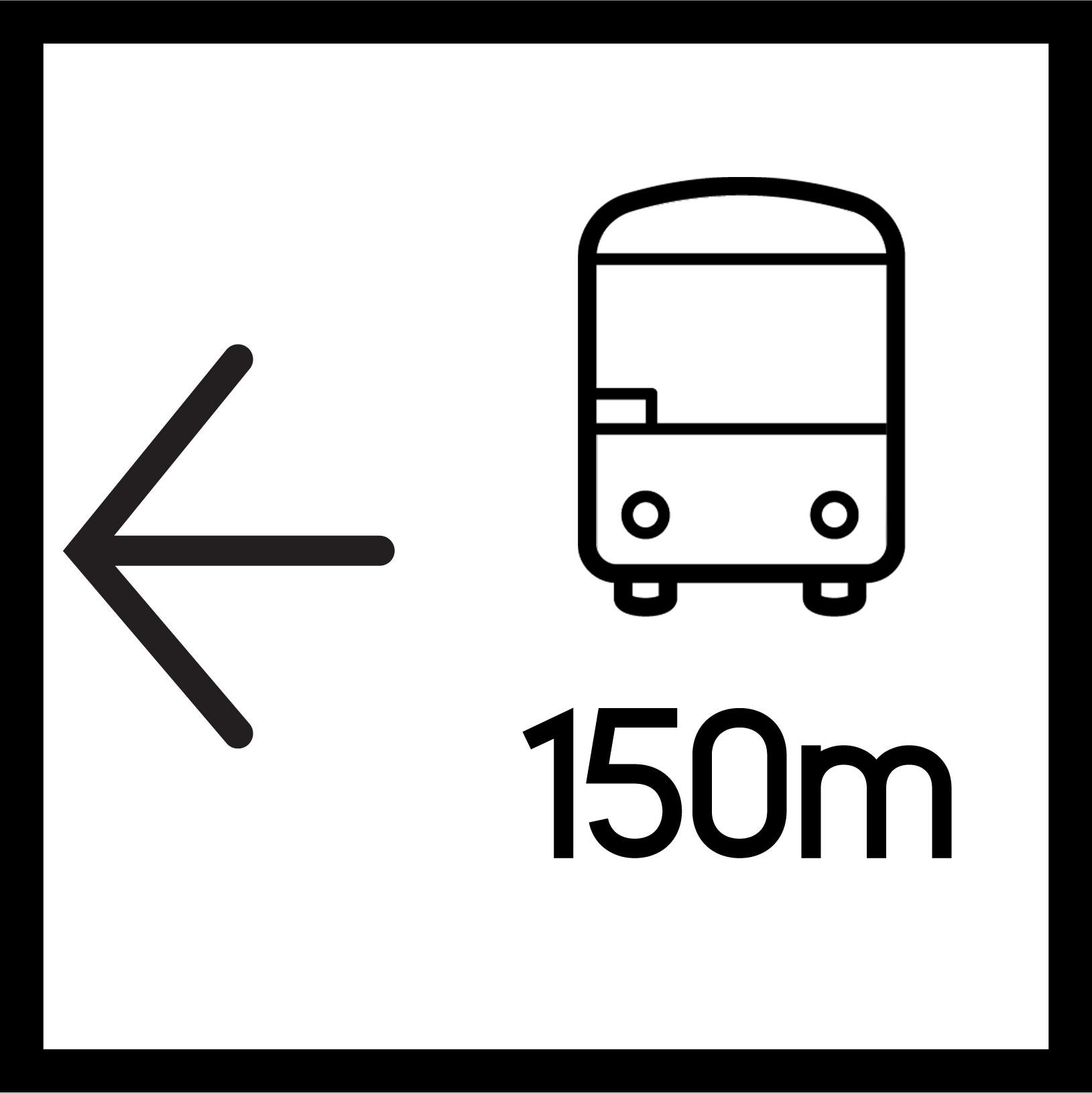
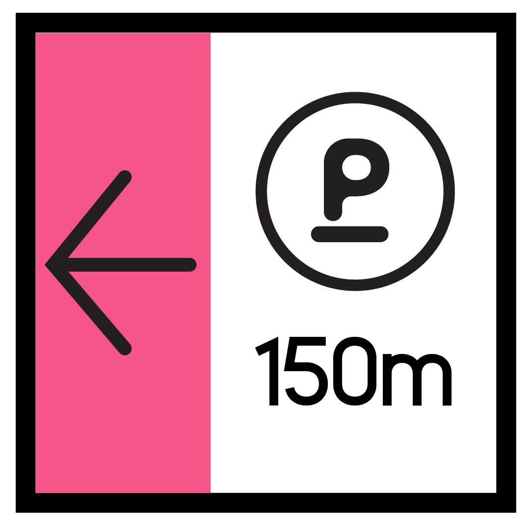
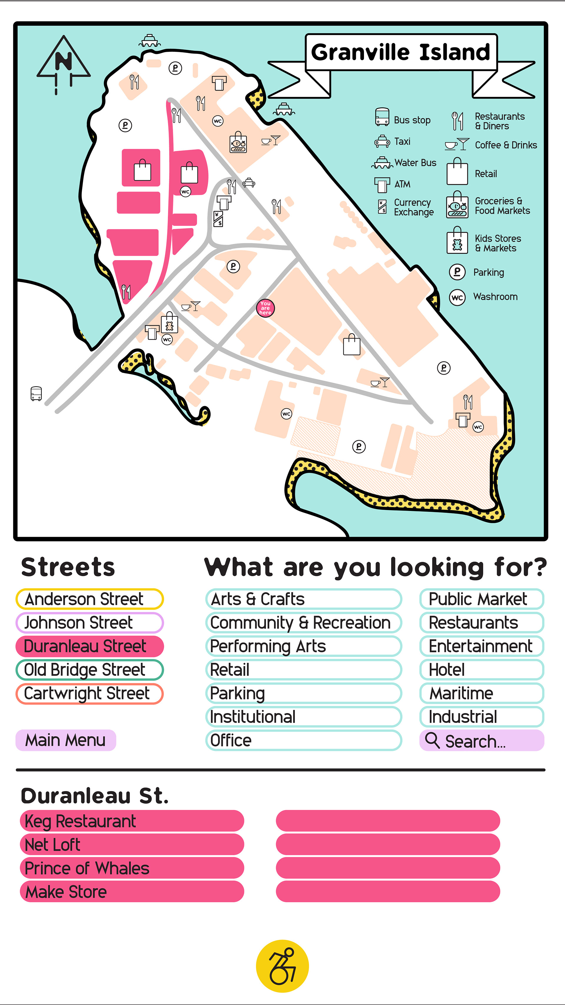
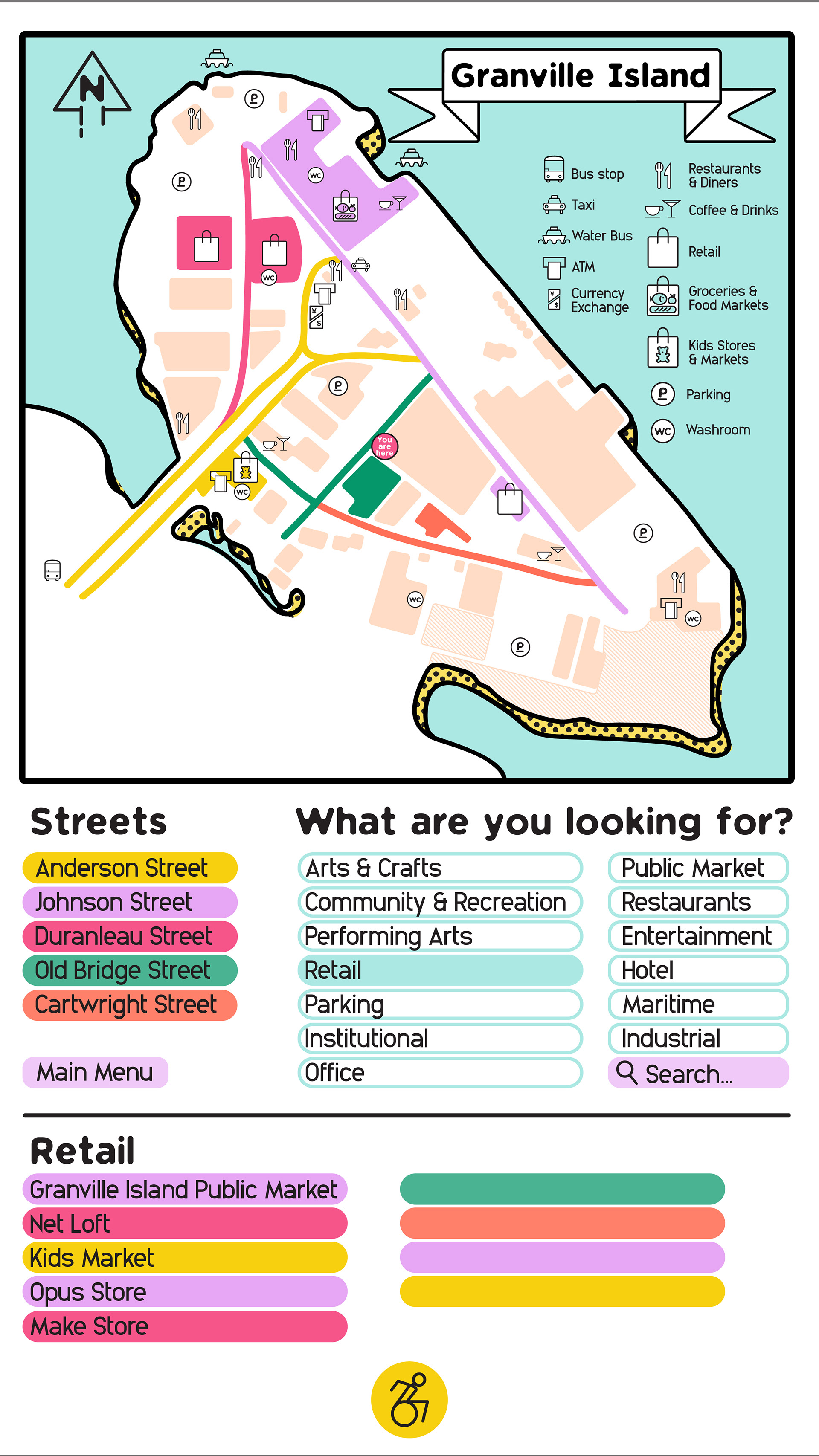
This signage concept is based on a system where each main street has its own colour scheme. The colour coding is integrated into the interactive maps found all over the ”island”, and also on the signage pylons and on to the actual streets themselves. This bold, graphic approach makes orientation easier for the visitors and adds playfulness. The pylons are made as a double-sided interactive screen and decorated with opaque plexiglass cubes—these cubes not only light up but can also be switched out and rotated during installation, to orientate the arrows that point out useful locations. Pylons located on smaller side streets have a mixed colour palette providing direction; additionally, on intersectional street corners the signage becomes two-toned.
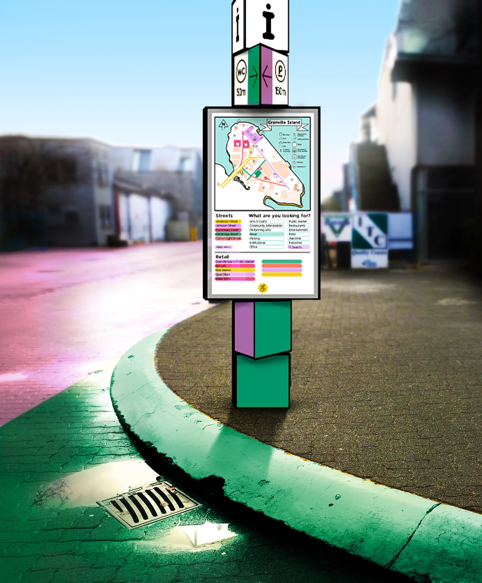
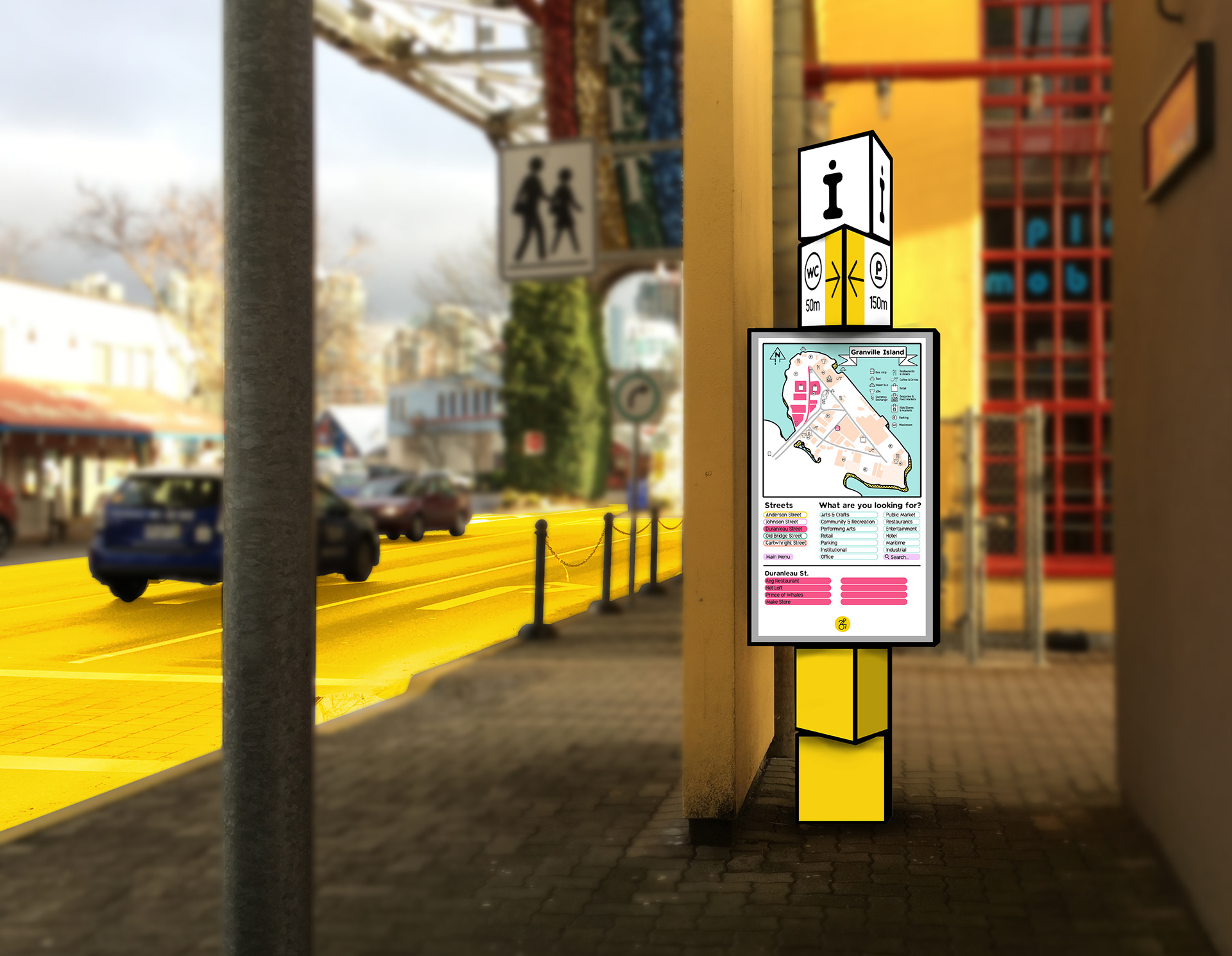
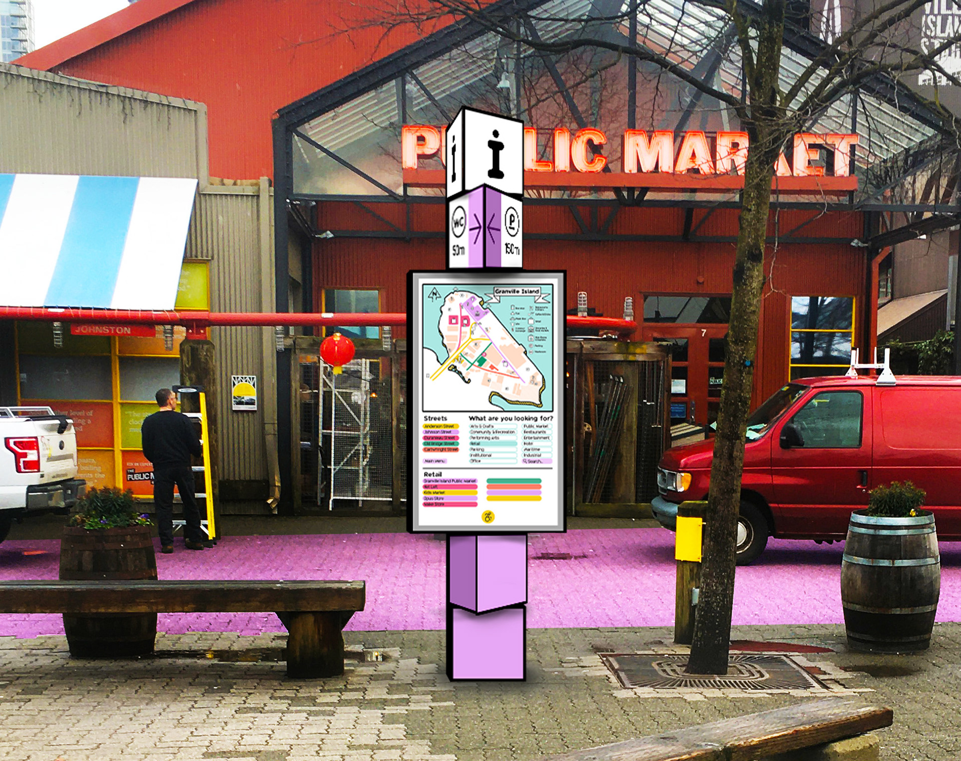
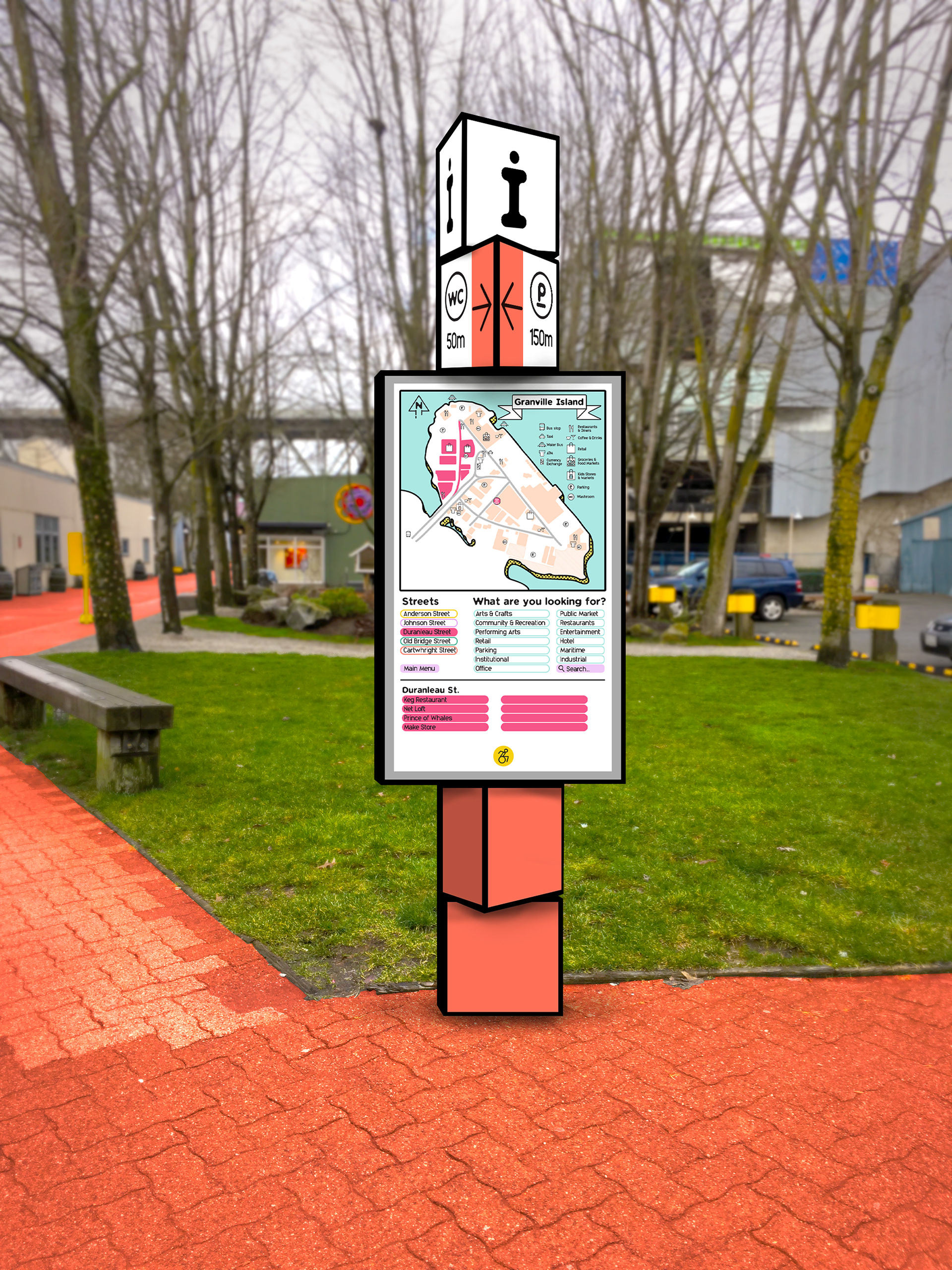
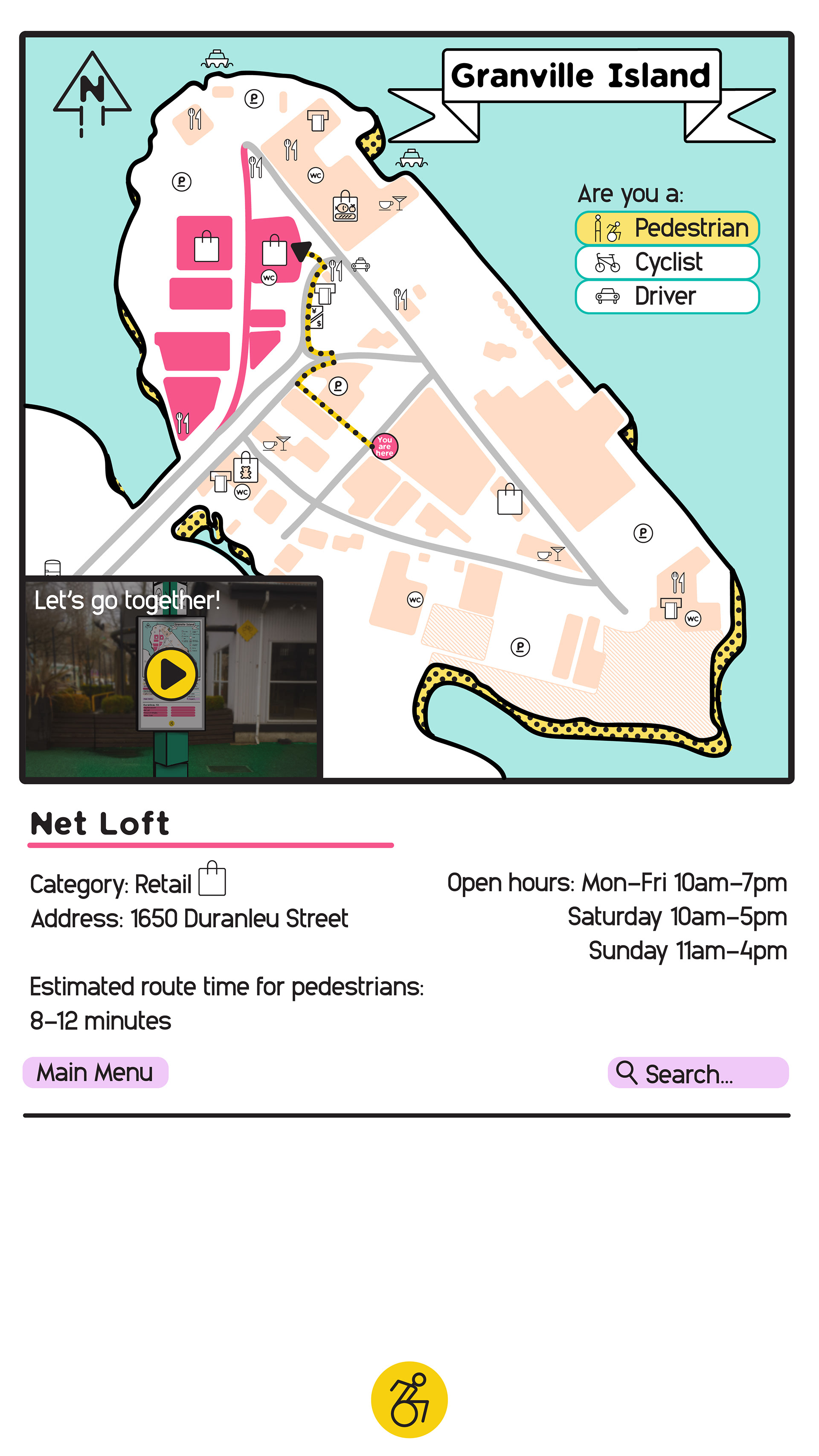
The interactive map itself has an accessibility function which moves the whole UI down to the bottom of the screen. The map includes the ability for users to filter by streets (colour) or category (for example, retail). Once the user chooses a location, refined information is provided to the user, including the route on the map as well as the ability to play a time-lapsed first-person video navigating their selection.